This tutorial is from
Blogger Busters!
The Minima template is the easiest Blogger template to customize, as this is the simplest two column template.
First of all, set your template to Minima (not the stretch template, but any color will do!), then follow these instructions:
1. Go to Template > Edit HTML, leaving the "Expand widget templates" box
unchecked.
2. Now, find this section in the HTML code:
#sidebar-wrapper {
width: 220px;
float: $endSide;
word-wrap: break-word; /* fix for long text breaking sidebar float in IE */ overflow: hidden;
3. Change float: $endSide: to float: right; in the sidebar wrapper code above
4. Copy the code below, and paste it directly under the sidebar wrapper code above.
#left-sidebar-wrapper {
width: 220px;
float: left;
word-wrap: break-word; /* fix for long text breaking sidebar float in IE */ overflow: hidden; /* fix for long non-text content breaking IE sidebar float */ }
(this will make the new sidebar float to the left of the main column)
5. Now, you need to find this section further down the page:
<div id='main-wrapper'></div>
6. Copy code below and paste it directly above the previous code above:
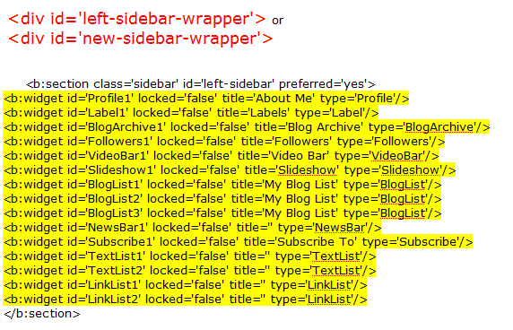
<div id='left-sidebar-wrapper'>
<b:section class='sidebar' id='left-sidebar' preferred='yes'/>
</div>
7. If you preview your template, you will notice that the right sidebar will be beneath the main section at the moment. This is because the outer-wrapper is still only wide enough to accommodate one sidebar. So now we need to expand the outer wrapper to accommodate this new sidebar.
8. Find this section in the HTML code, scroll up a ways:
#outer-wrapper {
width: 880px;
margin:0 auto;
padding:10px;
text-align:left;
font: $bodyfont; }
9. Change the width of the wrapper from 660px to 880px.
10. Now you need to change the width of the header-wrapper from 660px to 880px so that it spans the new width of your blog, you'll need to scroll up: T
#header-wrapper {
width:880px;
margin:0 auto 10px;
border:1px solid $bordercolor; }
11. You should PREVIEW & then SAVE your template if all is okay. Your new sidebar will not be show as there are no widgets contained within it, though it will still be present in the markup of the page. Once you have saved your template, go to
Layout >
Page Elements in your Blogger dashboard and drag your widgets to the left sidebar.
7. If you add anything to this left sidebar, you will probably notice that it bunches up to the main section. This is because there is no space defined between the left-sidebar and the main section. We need to create this space in the template's HTML. To do this, we will add a margin to the left side of the main posts section . Find the following code below in your template's HTML and add the code defined
margin-left:20px and change to float:left;; as shown below :
#main-wrapper {
width: 410px;
float: left;
margin-left: 20px;
word-wrap: break-word; /* fix for long text breaking sidebar float in IE */ overflow: hidden; /* fix for long non-text content breaking IE sidebar float */
This defines a margin space of 20px between the left-sidebar and the main column. You should also ensure you adjust the width of the outer-wrapper from 880px to 900px to ensure the width of your blog is enough to accommodate this margin too. Either that, or you could reduce the width of your main column/a sidebar by 20px to serve the same purpose. Now, PREVIEW your template.
8. Finally, SAVE your template and enjoy your new sidebar!
Also, you can configure your new sidebar to float to the right, and have two sidebars on the right of the main column if you prefer. Simply set the CSS of your new sidebar to float: right; instead.


 New posts coming soon :)
